There’s no disputing the calming effects of nature. In recent years, there have been studies to show that everything from bushwalking to working in the garden has a positive impact on our wellbeing. So it’s not much of a stretch to see how beneficial it can be to draw a little bit of our natural environment indoors.
After almost 10 years of interior spaces being dominated by every shade of grey, the colours of the earth and the landscape are already emerging as the next big idea in design.
While some have taken this approach literally, filling their homes with indoor plants and even adding internal water features, just bringing the colours that connect us to the natural world inside can create a sense of calm, serenity and security.
Colour category manager for Taubmans Paints, Rachel Lacy, says we’re more than ready for a warmer, more nurturing approach to our interior spaces.
“We’ve had a decade of greige (grey and beige) and white and colour does go in cycles,” Rachel says. “Right now we need more decoration and stimulation and these are easy colours for us to live with.”
Rather than the brights of the 80s, the creams of the 90s or even more recently, indigo blues, amethyst and deep purples of the past few years, colours of the natural world like burnt oranges, terracotta pinks, mustard yellows and virtually every shade of green are now topping the list of interior colours.
“It’s those colours on the edge (of the colour spectrum), like the edge of green before it goes to yellow or blue,” says Rachel. “Those are the softer tones. They are more complex.”
While this palette had already started to emerge at the end of 2019, the pandemic brought an added layer to it, bringing into sharp relief our reliance on overseas imports and our exposure to a less-than-secure world. Rachel says these colours, which are familiar to the Australian landscape, represent our interest in looking closer to home for inspiration, as well as a growing confidence in who we are as a nation.
“What we’re seeing is part of the trend of personalisation in design and Covid has fuelled that,” she says. “There’s now a renewed national pride for things that are ours, that are homegrown.”
After years of white, gallery-like spaces followed by grey interiors, Rachel says it’s understandable if some may be hesitant about working with this palette. However, she says it’s less of a gamble than most people think.
“Of all the indoor colour schemes, those greens and terracottas are incredibly resilient - they outlast everything,” she says. “Nature is always so generous with her hues.”
Painting rooms different colours, she says, is an easy way to set the mood for a space and create a sense of movement through the house.
“Paint is the most impactful and cost effective way to change a space and make it feel different,” she says. “I find with all-white houses there is nothing to differentiate the spaces. I want my bedroom to feel seductive and restful whereas I like my living room to be a little lighter.”
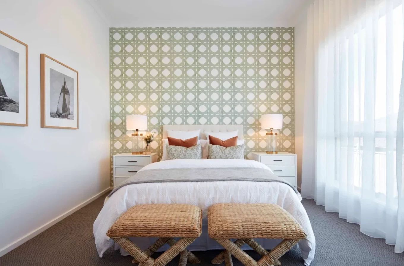
The key is to add those little splashes of colour, to elevate the whole space. Think of how an iridescent Gymea lily or waratah stands against the softer greens of the bush and you’ll get the idea.
Rachel says it’s not hard to achieve the same experience in your home.
“As a general rule, 60 percent of the room colours should be those we see around us a lot, 30 percent should be stronger colours and then 10 percent should challenge how we see things, which are those bright colours that might be best introduced through objects, like a bright orange vase or a single bright pink chair,” she says. “Those bright colours are important because they wake us up. And all those colours exist in nature.”
Head of interior design at Coco Republic, Diana Ribarevski, says she experienced the colour mastery of nature on a recent beachside holiday.
“I was taking walks along the beach, noticing the rocks,” she says. “There were beautiful reds next to soft greys and amazing muted greens. It’s a beautiful palette and it’s already there.”
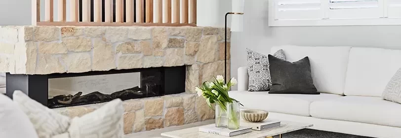
If painting a whole room in warm terracotta or sage green feels like a lot, Diana says you can opt for walls in a warm neutral white and introduce this palette slowly through your choice of furnishings. Materials in their natural state, such as raw timber, stone as well as the humble terracotta pot along with fibres such as wool, linen and even animal hides are an easy gateway to this palette.
“Sometimes you’re working the colour back with just a throw or a cushion or an occasional chair. It’s about layering different tones and colours,” she says. “We are seeing a lot of texture in addition to the earthy colours. People are working with raw stone left as it is and using linen in its undyed state - it all goes hand in hand.”
With so many decisions to make during building, Diana says a mood board, where you can bring all the elements of a room together, is a great place to start before you eat into the budget. Some people prefer to use actual paint swatches, benchtop samples, tiles and room images cut from magazines but a virtual mood board on sites like Pinterest will also help you bring your thoughts together in one place.
Play with them until you feel comfortable with the balance of colours and materials.
Diana says the fear of using something other than white for walls is often unfounded. The secret, she says, is to choose colours that speak to you, regardless of the current trends.
“People are often afraid they will get sick of colour, but that’s not necessarily the case,” she says. “I love the feeling of forest green - it’s a timeless colour and I know I won’t get sick of it.
“Forest green has a zen-like feeling and if it works in the natural world, I know it’s going to work in my home.”
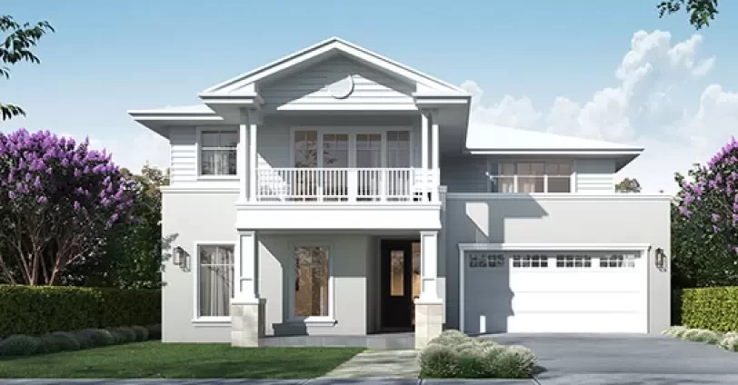
Discover our Display Home and Speak to our Experts
Visiting one of our Display Homes, is the best way to start your home-building journey, regardless of whether you are looking to build a new home, or planning a knock-down rebuild of your existing home.
Visit clarendon.com.au for a full list of locations and to make an enquiry or call us on 1800 173 595. Click here for more information on our Airlie design
Related Articles
View All Blog Articles
Storage solutions
Getting Started
Ever looked at pictures of real-life home interiors and wondered: “Where is all their stuff?” Whatever the size of your home and your family, it’s easy to accumulate things – and run out of places to put them. At Clarendon, we know that smart storage is key to reducing clutter, creating calm and making your home both enjoyable and functional.
Read More
Your Clarendon: The Cronulla White House
Design and Style
Cassandra lives with her husband and three sons in their Cronulla knockdown rebuild Australian Contemporary Beachside home.
Read More
How To Pair Your Personal Style With The Hamptons Trend
Design and Style
Since wealthy New Yorker, Dr. Theodore Gallard Thomas built the first mansion on Southampton’s Gin Lane in the late 19th Century, the elite have been spending their summers at the famous coastal enclave.
Read More
The Bronte 28 is a Natural Winner at Parklea
Design and Style
One of Clarendon Homes’ most popular designs has re-opened in Sydney’s north west with the opening of the Bronte 28, back on display at Parklea. This five-bedroom home is an exemplar of contemporary design with its mix of natural elements and neutral palette partnered with a flexible floorplan to create light-filled spaces ideal for families.
Read More